Re:NEWal // Branding Identity Experience

Re:NEWal
Transformation Spa
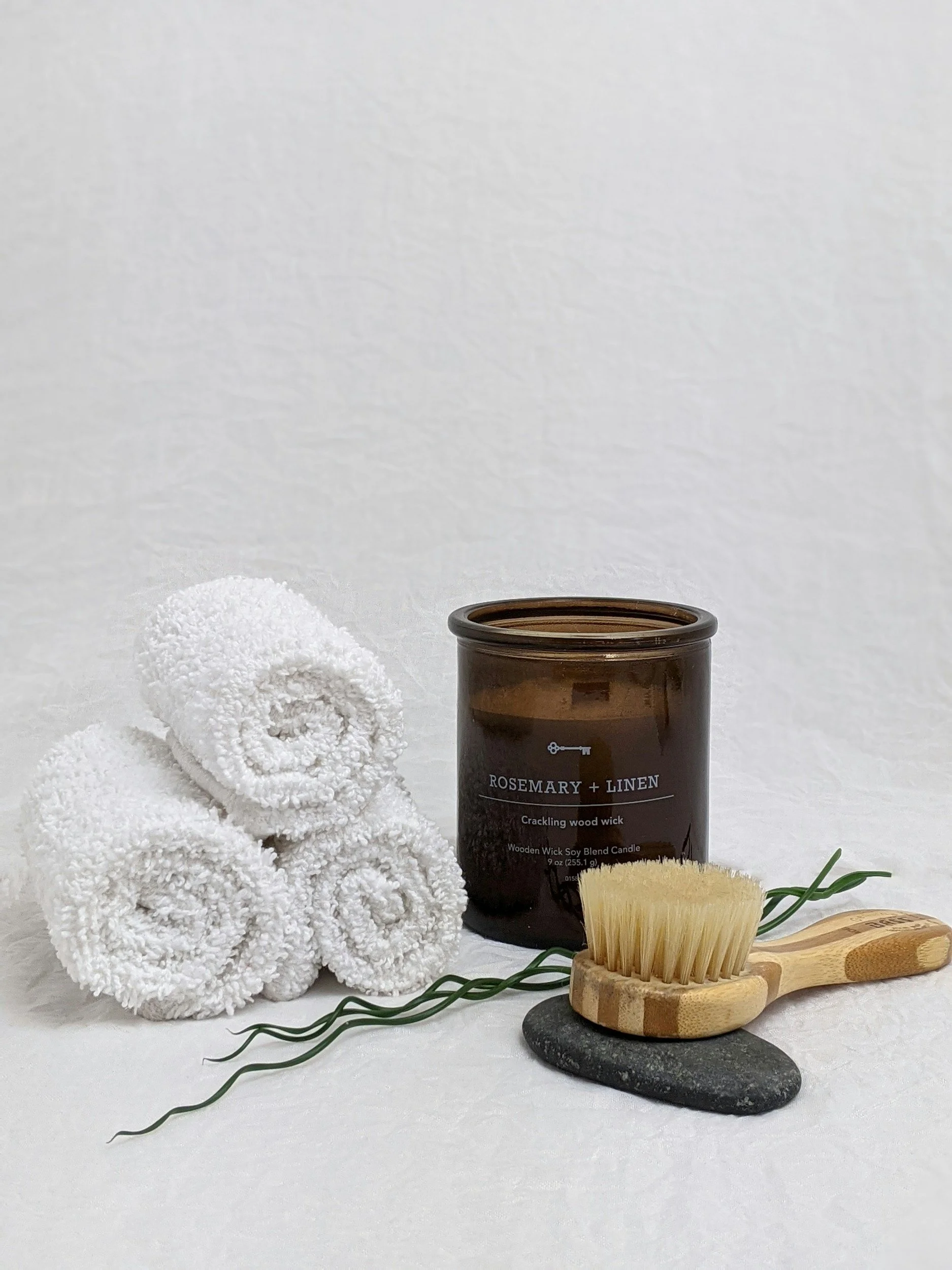
Re:NEWal is a transformational spa rooted in care, intention, and feminine ritual. Founded by Naydene, the spa offers more than just a service ~ it’s a space to feel seen, nourished, and at ease. Dedicated to optimal well-being and fostering a community dedicated to holistic health. With a focus on natural beauty and personal connection, the brand is designed for those who value softness, presence, and quiet luxury in their everyday routines.
A space to slow down, release tension, and support your body’s natural flow. Experience the transformative effects of a deep cleanse and emerge feeling rejuvenated, energized, and ready to thrive.
Brand StoryBrand Identity with Full Logo Suite
Custom Word-mark & Pictorial Logo
Print Collateral
Typography System
Custom Color Palette
Comprehensive Brand & Logo Use Guide
Scope of work
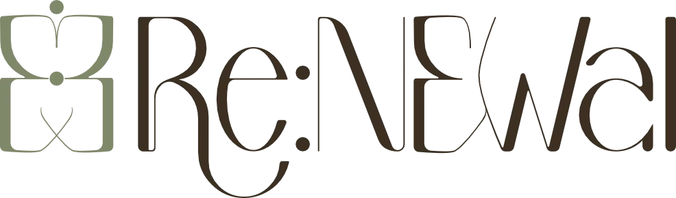
A visual identity that embodies the continuous flow of detoxification, renewal, and growth/thrive. I incorporated calming colors, natural elements, and a clean design to reflect their holistic approach.
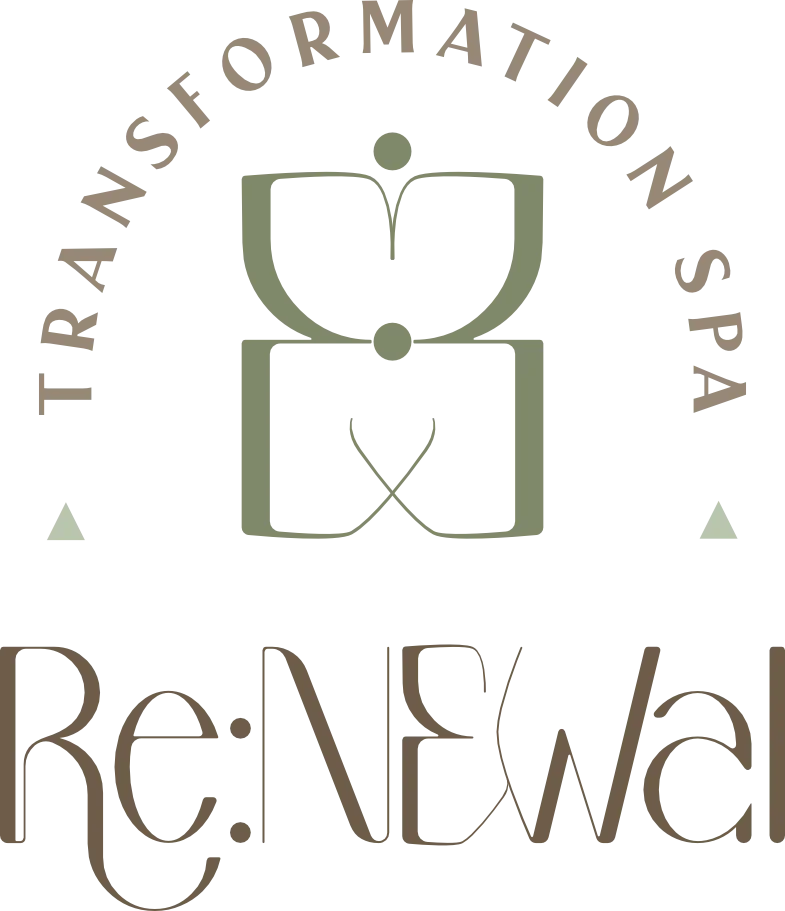
I created a custom word-mark with subtle curves that echo the contours of the body and the gentle movement. Variation logos including tagline, horizontal lockup, vertical lockup, and full emblem for signage. Along with a pictorial logo, formed from the letter “E” and “:”, a butterfly that symbolizes transformation, gentleness, and hope.
Print materials were kept simple and tactile, with textured papers and clean layouts that support the intimate, high-touch experience of the spa. Every element was designed to feel personal, natural, and effortless.
my creative approach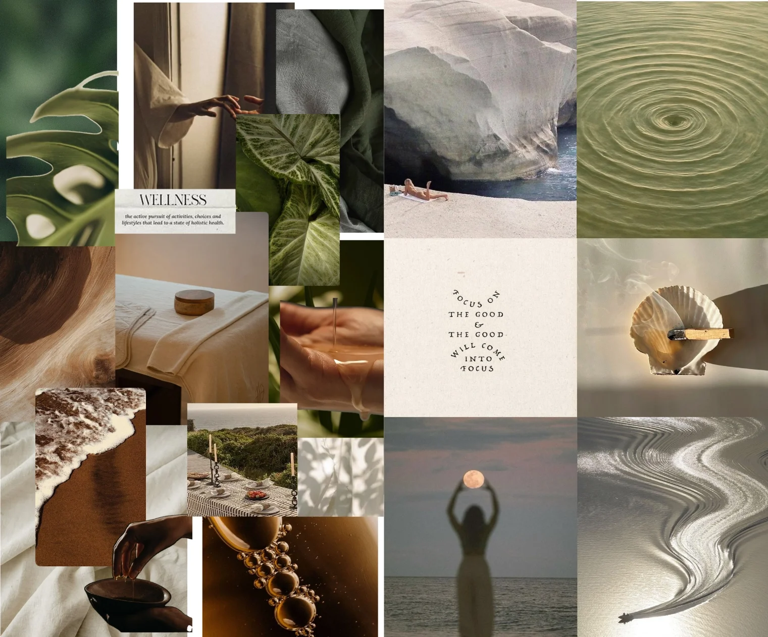
Visual mood board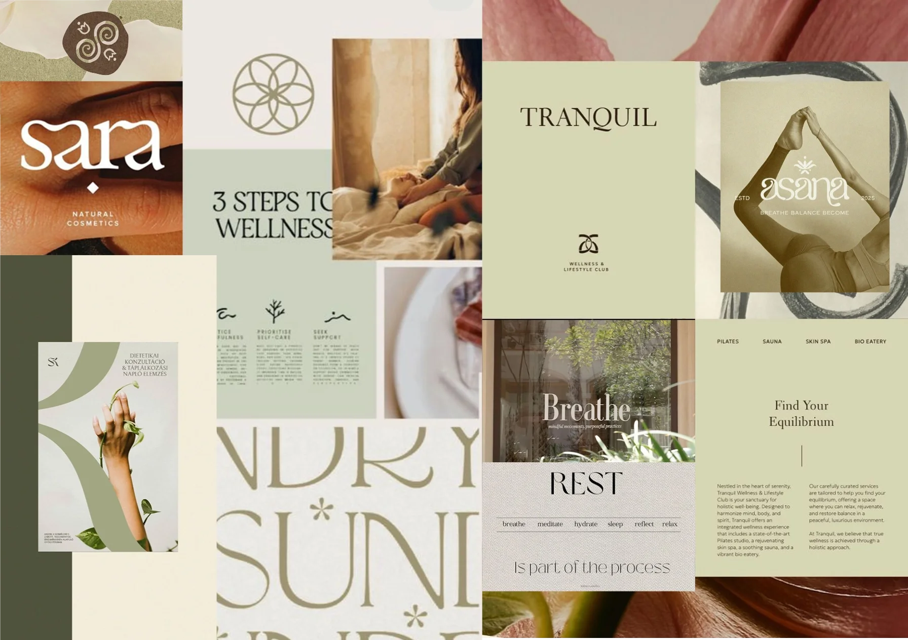
Typographic mood board
feels:
Personal, natural, holistic, relaxed, & elegant.