Mulberry Jeweler
// Branding & Visual Identity & Web Design
In this project, I was challenged with the comprehensive development of the Mulberry brand from the ground up, inspired by the boundless sophisticated beauty of nature based on the name Mulberry, a type of fruit-bearing tree.
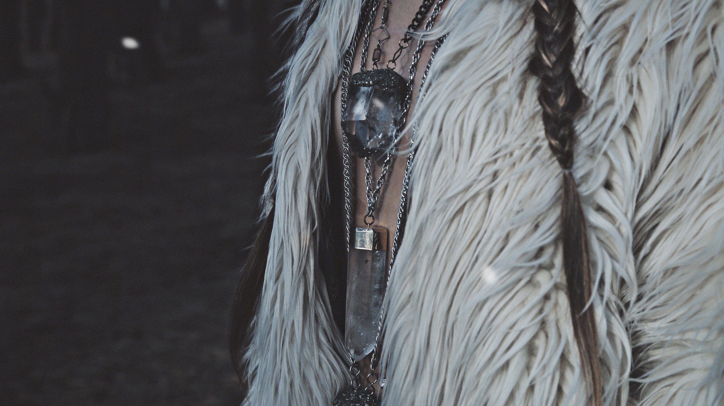
Mulberry, a California-based couture micro-label, comprises one-of-a-kind vintage reconstructed jewelry and accessories. This “slow fashion” label features the sort of organic glamour that transforms mere mortals into goddesses.
All beautiful things take time and care to make, so this new brand is focused on responsible and sustainable approaches with handmade processes and locally sourced materials.
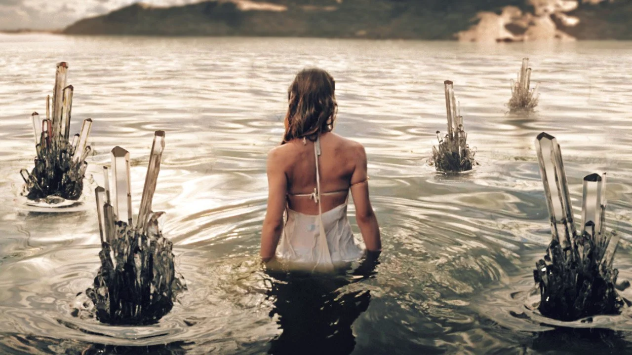
From ethereal headpieces with layered chains to raw crystal embossed body harnesses and rings, Mulberry delivers an undeniable, awe-inspiring, and magnificent look for whoever graces it. 
Logo
I aimed to establish a distinctive identity and cohesive graphic language that could be seamlessly executed in-house after delivery. Central to this endeavor was infusing the brand with a personal, handcrafted aesthetic with inclusive elegance, ensuring it faithfully reflects its core philosophy.
Through typographic studies of both my personal hand lettering and traditional typography I choose to design a logotype that has a contemporary and old-world feel. This allows for a more gender neutral and sophisticated look that appeals to a wide range of consumers.

A strong sans serif with rounded elements softens the letterforms making it both empowering and welcoming. The deep mulberry purple color allows for a simple yet refined color palette that echoes the quality of royalty elevating percieved value.

To further the concept of upcycling and giving new life to old discarded things, it was important to use environmentally friendly and recycled materials as a sustainable design choice without going over budget.
This is why the stationary system, packaging, and brand book were all designed with 100% recycled compostable paper.
The jewelry box is made from a thick paper substrate that has small seeds embedded within, which could either be reused or planted in the ground to grow wildflowers.
The tote bags are adorned with handwritten calligraphy and are screen-printed with soy-based ink on 100% recycled cotton canvas.

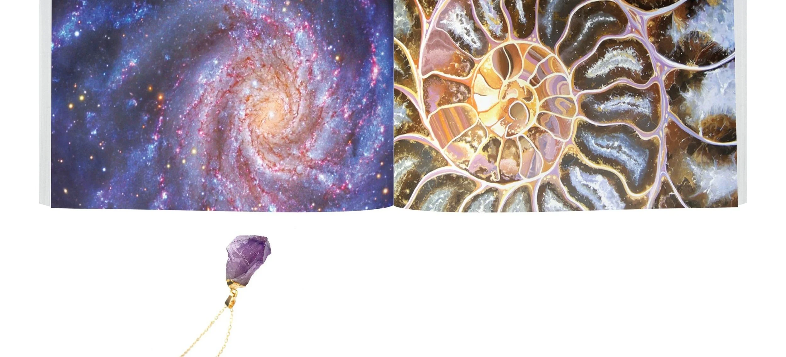
The look-book transformed the brand into a state of mind where customers can immerse themselves in Mulberry’s “Earthly Energy.” Using the power of visual juxtaposition and color, viewers can reflect upon the natural power that raw Earthy materials Mulberry uses in their jewelry.
Look Book
Not only does the book share the values and philosophy of the brand, but it also serves as a tool that customers can utilize to educate themselves about the various materials that they can adorn themselves with. This provides the background and product knowledge that some customers might be looking for to justify purchases and ensure brand loyalty.

Website Design
Shoppers can easily find what they need with minimal navigation and visual clutter paired with thin sans-serif typography that doesn’t distract from the jewelry itself. The main product photography was shot on the craftsman’s wooden work table to emphasize the handcrafted process.
The website continued the visual system bringing energy into Mulberry’s web presence. Since this small slow-fashion label is locally run and sourced, it needed a strong user-centered web design that also combines modern elegance with an old-world charm.
Within the individual product pages are additional close up pictures on a clean white background and on a model, so that the customer can better envision it on themselves and see the craftsmanship in greater detail.

Aditional Credits:
Selected Photography by Franco Carlesimo & Barbara C. Pellegrino
Jewelry Designs by BCP Jewelry