

Academic Concept ProjectScrap SF App
// UX/UI & Brand Visual Identity Experience
SCRAP SF is a San Francisco-based nonprofit with a mission to stimulate creativity and environmental awareness by promoting the creative reuse of materials that would otherwise be discarded as waste. They redistribute salvaged supplies to underfunded schools, teachers, artists, parents, and community organizations, turning someone's trash into someone else's treasure. For this academic concept project, I designed a full visual identity and mobile app experience to extend that mission into a digital platform.
Brand story:SCRAP SF's model depends on community participation, but without a streamlined way to connect donors with recipients, reusable materials continue to end up in landfills. The challenge was to design a mobile platform that made collecting and redistributing materials feel as easy and approachable as the organization's mission itself, while reflecting the playful, creative spirit of the brand.
the challenge:Brand visual identity design
UX/UI mobile app design
User persona generation
User interviews and journey mapping
Design principles and app information architecture
Typography and design element studies
Sketching and wireframing
Paper prototype testing
Digital wireframes and visual design
Interactive digital prototype
UI iteration based on usability feedback
Scope of work:I’m passionate about creating visually compelling user interfaces & experiences on:
user-centered design principles
inclusive accessibility best practices

Visually, I leaned into the brand's energy. Bright shapes, a friendly color palette, and a clean interface were all deliberate choices to signal that this is a platform for creative people of all kinds, not just designers or environmentalists. The identity needed to feel inclusive and energizing, not worthy and dull.
my Creative Approach:I started where the problem lives: with the people. Through user interviews and persona generation, I mapped out who was actually using SCRAP SF's services and what friction stood between them and participation. That research shaped the app's core features, a streamlined map interface, a profile rating system, and simple navigation designed to get users to what they need in as few steps as possible.
Strategic Process: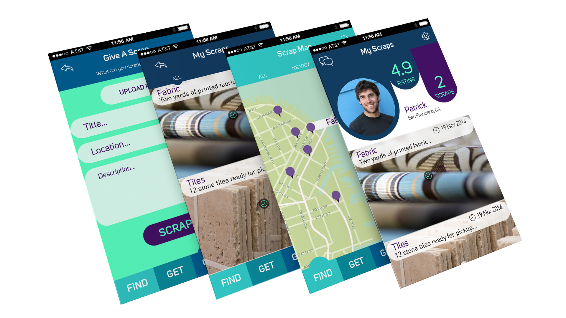
streamlined maps
profile rating systems
simple navigation

Give a Scrap
✶
Give Back
✶
Give a Scrap ✶ Give Back ✶
From sketches and paper prototypes to digital wireframes, I tested and iterated on the UI at each stage, refining functionality to reduce friction and improve ease of use.
The result is a concept that transforms the generosity of SCRAP SF's mission into a digital experience people would actually want to use.
This app was designed with usability in mind to quickly connect users with the resources they need.
